Understanding the ROI across all of your paid marketing channels is a top priority for senior-level executives across every industry and every geographical market. Getting a clear sense of the ROI on each channel allows companies to answer really important questions. For example:
- What will happen if I increase my Email spend by 20%?
- What is the level of saturation I can expect from my Paid Search channel?
- How do I incorporate seasonality into my budget allocation strategy?
- How do I optimize my budget allocation across all of my paid channels?
- Which geographies should I focus my efforts?
These are consequential questions that have the potential to have a major impact on how a business operates. With that, it’s no wonder that companies devote significant time, energy , and resources to creating (or purchasing) a Marketing (or Media) Mix Modeling framework. The aim of this post is to show you how you can use the data that you already have in conjunction with open source tools to create your own MMM solution.
We will take a look a more in-depth look at the example Trevor and I co-presented at Adobe’s Digital Marketing Summit this past March. While we will only be examining a single channel, a creative analyst could use this as the foundation for a larger MMM effort. Many times, the analysts I work with are given a target for the amount of revenue a particular marketing channel is responsible for contributing to the overall business. The question I am often asked is, “How much do I need to spend in my channel to reach my revenue goal?”
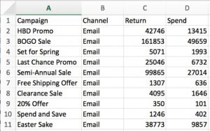
Let’s start by taking a quick look at the data:

For this example, we are looking at Email channel data. This data set is aggregated to the campaign level, meaning each row represents one unique campaign, which is designated in the first column. Since we are examining the single channel case, it comes as no surprise that each campaign roles up to the Email channel. The third column, Return, is some measure of value to your site. This will vary depending on two things:
- What is valuable to your site? Are you in the retail industry where customers are making purchases directly on your site? If so, you may want to use Revenue or Orders for your measure of value. Are you a media site where consumption of content is the most important metric? If so, you may want to use blog views or subscriptions as your measure of value. Return will always be specific to your industry and your business organization.
- What type of attribution model are you using? The amount of Return allocated to each campaign will be directly affected by the attribution method that you deploy. Most companies are using simple, rules-based attribution methods like first touch or last touch. These are great places to start. If your organization is a little further in its analytics journey, you may want to think about using a more algorithmic, data-driven approach.
The last column, Spend, is a measure of cost associated with that campaign. This could include direct costs as well as indirect costs. For example, the cost of each email campaign is typically tied to the number of emails that were sent – this is a direct cost. We may want to consider including some of the indirect costs of the time and resources that created the visual and manage the email with a vendor. The indirect costs are typically more difficult to quantify, so including just the direct costs is usually a good starting point.
Let’s continue by loading and visualizing the data in R. We are using the gglot2 library to create our plot. The plot is stored in the p1 object:
# Load libraries #
library(ggplot2)
library(scales)
library(dplyr)
library(gridExtra)

#  Load data files  #
fileName = "oneChannelData.csv"
myData = read.csv(file = fileName, header=TRUE, sep=",")


#  Plot data  #
channelName = as.character(myData$Channel[1])
maxX = 1.05*max(myData$Spend)
maxY = 1.05*max(myData$Return)

myPlotDataDF = data.frame(Return = myData$Return, Spend = myData$Spend)

simpleScatterPlot <- ggplot(myPlotDataDF, aes(x = Spend, y = Return)) +
  geom_point(color="black") +
  theme(panel.background = element_rect(fill = 'grey85'),
        panel.grid.major = element_line(colour = "white")) +
  coord_cartesian(ylim = c(0,maxY), xlim = c(0,maxX)) +
  scale_x_continuous(labels = dollar) +
  scale_y_continuous(labels = comma) +
  ggtitle(paste(channelName))

simpleScatterPlot

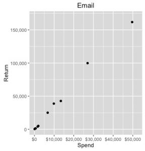
This is a fairly simple scatter plot. On the x-axis we have Spend and on the y-axis we have Return. The black dots represent the individual data points from my data set. Just from this simple plot, we can start to see the relationship between Spend and Return. At first glance it looks like it might be a good idea to model this relationship with a linear model. I would advise against this for a couple of different reasons:
- A linear model assumes that you have infinite growth.
- There are real-world phenomena like market saturation and email fatigue that suggest infinite growth is not actually possible.
We need a model that exhibits diminishing marginal returns. Diminishing marginal return means that the rate of return will decrease the more you spend. The ADBUDG model is a very flexible model that incorporates diminishing marginal returns. The ADBUDG model is defined as follows:

Just as a linear model is governed by parameters (slope and intercept), the ADBUDG model is also governed by parameters. There are four ADBUDG model parameters:
- A – The maximum amount of return possible for a campaign given a long term investment.
- B – The minimum amount of return possible for a campaign given a long term investment
- C – Controls the shape of the curve.
- D – Represents initial market share or market saturation effects.
These four parameters actually give the shape and behavior of the model a lot of flexibility. How can we figure out what the values of these parameters should be? There is no build-in ADBUDG function in R, so I used optimization techniques to determine the values of these parameters. This is where I would encourage you to put on your data science hats!
There are many different optimization functions in R. I’m going to demonstrate how to use the nlminb() function, which is part of the stats package in R (See the documentation here: https://stat.ethz.ch/R-manual/R-devel/library/stats/html/nlminb.html). The nlminb() function works by minimizing the return value from some function. The nlminb() function has several arguments. We are only going to require the following:
- objective – The function to be minimized
- start – Initial values for the parameters to be optimized
- lower – Lower bound for constrainted parameter optimization
- upper – Upper bound for constrained parameter optimization
- control – Additional control parameters
First thing we need to do is define our objective function. Just as in a linear model, the goal is to find parameter values that minimize the error between the actual data observed and the predicted values from the model. To align with how the nlminb() function operates, we need to create a custom function that returns the total observed error based on the ADBUDG model.
Ufun<-function(x, Spend, Return) {
  predictedReturn = x[2] + (x[1] - x[2])*((Spend^x[3])/(x[4] + (Spend^x[3])))
  errorSq = (predictedReturn - Return)^2
  sumSqError = sum(errorSq)
  return(sumSqError)
}
Let’s walk through the function step-by-step. There are three inputs to the function. The “x” variable is a vector of length four and represents the four parameters of the ADBUDG function. Spend and Return are also vectors which correspond with the Spend and Return data from your data file. Their length will be the same as the number of data points in your data file. The temp1 object calculates the predicted Return from the ADBUDG equation. That vector is then used in the next line when we calculate the squared error for our predicted values, which are stored in the temp2 object. Lastly, we sum the temp2 object to get a single value for the sum of squared errors, which is stored in the temp3 object. The temp3 object is the return object for this function. When we minimize this function, we are essentially minimizing the sum of squared error, which is actually the same thing that is done in linear regression. See, you knew exactly what we were doing here, right?!
With the hard part out of the way, we can create some start values, as well as upper and lower bounds:
startValVec = c(25000,100,1.5,100000)
minValVec = c(0,0,1.01,0)
maxValVec = c(500000, 500000, 2, 10000000)
These values should be based upon the Return values possible for you data. Return data is typically positive, meaning our minimum values for A and B are 0. Representing market share or saturation, D must also be positive. The minimum value of C will ultimately depend on what metric you are using for Return. This data is based on revenue which should have an ROI greater than 1.01, otherwise, we would not invest in that channel. So we will use 1.01 as our minimum value for C. In cases where the ROI is less than 1, we will want to reflect that in our minimum value vector. I’ve provided maximum values that are quite large, which will allow the optimization function a large space to explore. Finally, I chose starting values that are somewhere inbetween. Final parameter optimization should not depend on your starting values. If they do, there may be something else at play that we need to consider. The control arguments of the nlminb() function allow you to fine tune the execution of the optimization function. We will use several arguments that limit the iterations possible. Our final nlminb() function is as follows:
optim.parms<-nlminb(objective=Ufun,start=startValVec,
                    lower=minValVec,
                    upper=maxValVec,
                    control=list(iter.max=100000,eval.max=2000),
                    Spend = myData$Spend,
                    Return = myData$Return)
optim.parms
The output of my optim.parms object tells us a few helpful pieces of information. The most important of which are the parameters themselves, as well as whether or not we had successful convergence.
> optim.parms
$par
[1] 4.178821e+05 1.671129e+02 1.198282e+00 6.686292e+05

$objective
[1] 60148527

$convergence
[1] 0

$iterations
[1] 51

$evaluations
function gradient
      92      223

$message
[1] "relative convergence (4)"
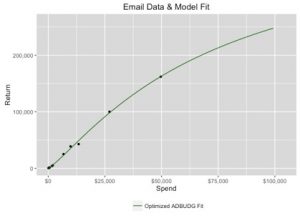
A convergence code of 0 indicates successful convergence. We can extract our parameter values by taking a look at optim.parms$par. Let’s take a look at how these parameter values fit on the data we observed. Once again, we’re going to use ggplot2 to build our plot. Now that the plot will include the ADBUDG model, building the data frame to feed into ggplot2 is a little more complex. My data frame now includes a data frame for the ADBUDG curve as well as the actual data points:
a = optim.parms$par[1]
b = optim.parms$par[2]
c = optim.parms$par[3]
d = optim.parms$par[4]

curveDFx = seq(from=0, to=max(myData$Spend)*2, length.out=10000)
curveDFy = b+(a-b)*((curveDFx^c)/(d+(curveDFx^c)))
curveDF = data.frame(Spend = curveDFx, Return = curveDFy)

maxX = 1.05*max(curveDFx, max(myData$Spend))
maxY = 1.05*max(curveDFy, max(myData$Return))

myPlotDataDF = data.frame(Return = myData$Return, Spend = myData$Spend)
optimLineDF = data.frame(Spend = curveDFx, Return = curveDFy)

scatterPlotPlusFit <- ggplot(myPlotDataDF, aes(x = Spend, y = Return)) +
  geom_point(color="black", shape = 16) +
  theme(panel.background = element_rect(fill = 'grey85'),
        panel.grid.major = element_line(colour = "white")) +
  geom_line(data = optimLineDF, aes(x = Spend, y = Return, color = "darkgreen"))  +
  scale_color_manual(labels = "Optimized ADBUDG Fit",values=c('darkgreen')) +
  theme(legend.title=element_blank(), legend.position = "bottom") +
  coord_cartesian(ylim = c(0,maxY), xlim = c(0,maxX)) +
  scale_x_continuous(labels = dollar) +
  scale_y_continuous(labels = comma) +
  ggtitle(paste(channelName, "Data & Model Fit", sep = " "))

scatterPlotPlusFit

Looks like the model fits pretty well! Now we are ready to use the model! Our original question was, “How much do I need to spend in my channel to reach my revenue goal?” My original data set had about $390K worth of Return represented. Let’s suppose my return goal was actually $600K. How much should I increase my spend in each of my campaigns to reach that goal? Let’s start by explaining and initializing some variables:
adbudgReturn = function(a,b,c,d,Spend){
  adbudgReturn = sum(b+(a-b)*((Spend^c)/(d+(Spend^c))))
  return(adbudgReturn)
}

returnGoal = 600000
increment = 1000
oldSpendVec = myData$Spend
oldReturn = adbudgReturn(a,b,c,d,oldSpendVec)
newSpendVec = oldSpendVec

totalSpend = sum(oldSpendVec)
totalReturn = oldReturn
The adbudgReturn() function simply provides me with a projection of the return given a current level of Spend and a set of parameters. We will use this function when evaluating which channel to allocate an incremental budget. I then created a function that evaluates the impact of an extra $1000 in each channel. The money is then given to whichever channel produced the highest incremental return. It performs this action over and over again in a while loop until the total return has reached the return goal amount.
while(totalReturn < returnGoal){
  incReturns = NULL
  for(i in 1:length(oldSpendVec)){
    oldSpendTemp = newSpendVec[i]
    newSpendTemp = newSpendVec[i] + increment

    oldReturnTemp = b+(a-b)*((oldSpendTemp^c)/(d+(oldSpendTemp^c)))
    newReturnTemp = b+(a-b)*((newSpendTemp^c)/(d+(newSpendTemp^c)))

    incReturns[i] = newReturnTemp - oldReturnTemp

  }

  winner = which.max(incReturns)
  newSpendVec[winner] = newSpendVec[winner] + increment

  totalSpend = totalSpend + increment
  totalReturn = adbudgReturn(a,b,c,d,newSpendVec)

}
Let’s take a look at the recommended spend for each campaign. I’m organizing the recommended spend values in a data frame that looks very similar to my original data:
newReturnVec = b+(a-b)*((newSpendVec^c)/(d+(newSpendVec^c)))
myRecommendedData = data.frame(Campaign = myData$Campaign,
                       Channel = myData$Channel,
                       Return = newReturnVec,
                       Spend = newSpendVec)

sum(myRecommendedData$Spend) # Recommended Spend
sum(myRecommendedData$Return)  # Estimated Return from Recommended Spend
sum(myRecommendedData$Spend)/sum(myData$Spend) - 1  # % Increase in Spend to get $600K

> sum(myNewData$Spend) # Recommended Spend
[1] 171455
> sum(myNewData$Return)  # Estimated Return from Recommended Spend
[1] 603582.2
> sum(myNewData$Spend)/sum(myData$Spend) - 1  # % Increase in Spend to get $600K
[1] 0.5383339
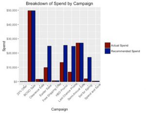
From this output we can see exactly how much spend to allocate to each of my campaigns. We can also see that in order to reach my return goal of $600K, I had to spend a little over $171K. This represents nearly a 54% increase in my overall spend.
There are a couple of different ways we can summarize and visualize these recommendations. One helpful visualization is a bar graph that shows the original and recommended spend for each campaign. Let’s use ggplot2 to accomplish this. To do that, I will create a data frame that contains both the original spend and the recommended spend and then use the geom_bar() function of the ggplot2 to create my plot:
#  Graph current spend vs recommended spend  #
compareDF = data.frame(Campaign = rep(myData$Campaign,2), spendType = rep(c("Actual Spend","Recommended Spend"), each=dim(myData)[1]), Spend = c(myData$Spend, myRecommendedData$Spend))

barChart <- ggplot(data=compareDF, aes(x=Campaign, y=Spend, fill=spendType)) +
  geom_bar(stat="identity", color="black", position=position_dodge())+
  scale_fill_manual(values=c('darkred','darkblue'),
                      name = "") +
  scale_y_continuous(name="Spend", labels = dollar) +
  theme(axis.text.x = element_text(angle = 45, hjust = .75)) +
  ggtitle("Breakdown of Spend by Campaign")

barChart

A table format would be another simple, but useful visualization. For this representation of the data, I will add a percentage difference measure to show how spend changed between my original and recommended spend amounts:
percDiff = (myNewData$Spend - myData$Spend)/myData$Spend
summaryDF = data.frame(Campaign = myNewData$Campaign,
                 Channel = myNewData$Channel,
                 actualSpend = dollar_format()(myData$Spend),
                 recommendedSpend = dollar_format()(myNewData$Spend),
                 percDiff = percent((myNewData$Spend - myData$Spend)/myData$Spend))

summaryDF
So now we have an answer to the amount of increased spend I will need to reach my return goal of $600K. While this is a very simple example, it has proven to be very useful for a number of the analysts I’ve worked with. This code actually serves as the foundation of the cross-channel Marketing Mix Modeling framework I’ve developed. Hopefully this has provided a good introduction into MMM and how you can use tools readily available at your disposal to build your very own Marketing Mix Model!

thank you for sharing the post. Would you mind sharing the csv file so I can test it out? Thank you so much.
I would also like to take a look at the .csv file to understand the details of your code.
Thank you for sharing! 🙂
Hi Jessica,
This is helpful, thanks for sharing. Is it possible to look at the .csv file to understand the code in depth.
Also, in this case, how did you get the return, Is it last click from GA?
Hi Jessica,
This is helpful, thanks for sharing !! It would be great if you can share .csv file to understand the code in depth.